In this tutorial we will load in the data created in the second tutorial and make some plots
Plotting in Tidyvserse is handled by the ggplot package
library
library(tidyverse)###Read in the data we created in TidyTutorial 2
dat<-read.csv("Tidy2_dat.csv")###This data contains five variables: id, group, time, score, and score_2
###We will use this data to go over the basics of plotting with ggplot
head(dat)## id group time score score_2
## 1 1 0 0 0.30 0.30
## 2 1 0 1 0.26 0.76
## 3 1 0 2 0.53 1.53
## 4 1 0 3 1.90 3.40
## 5 1 0 4 -1.77 0.23
## 6 1 0 5 -3.61 -1.11#Tidyverse part 1: ggplot (it’s for plotting)
##We can “initiate” a plot with the ggplot function
dat %>% ggplot()
#Here we have a "blank" plot##We can then add a some ‘aesthetics’ with aes
dat %>% ggplot(aes(x=time, y=score))
#This sets the x and y axis, but we still have not added any data to the plot##Now we can add a ‘layer’ to the plot using ‘+ geom’
dat %>% ggplot(aes(x=time, y=score))+geom_point()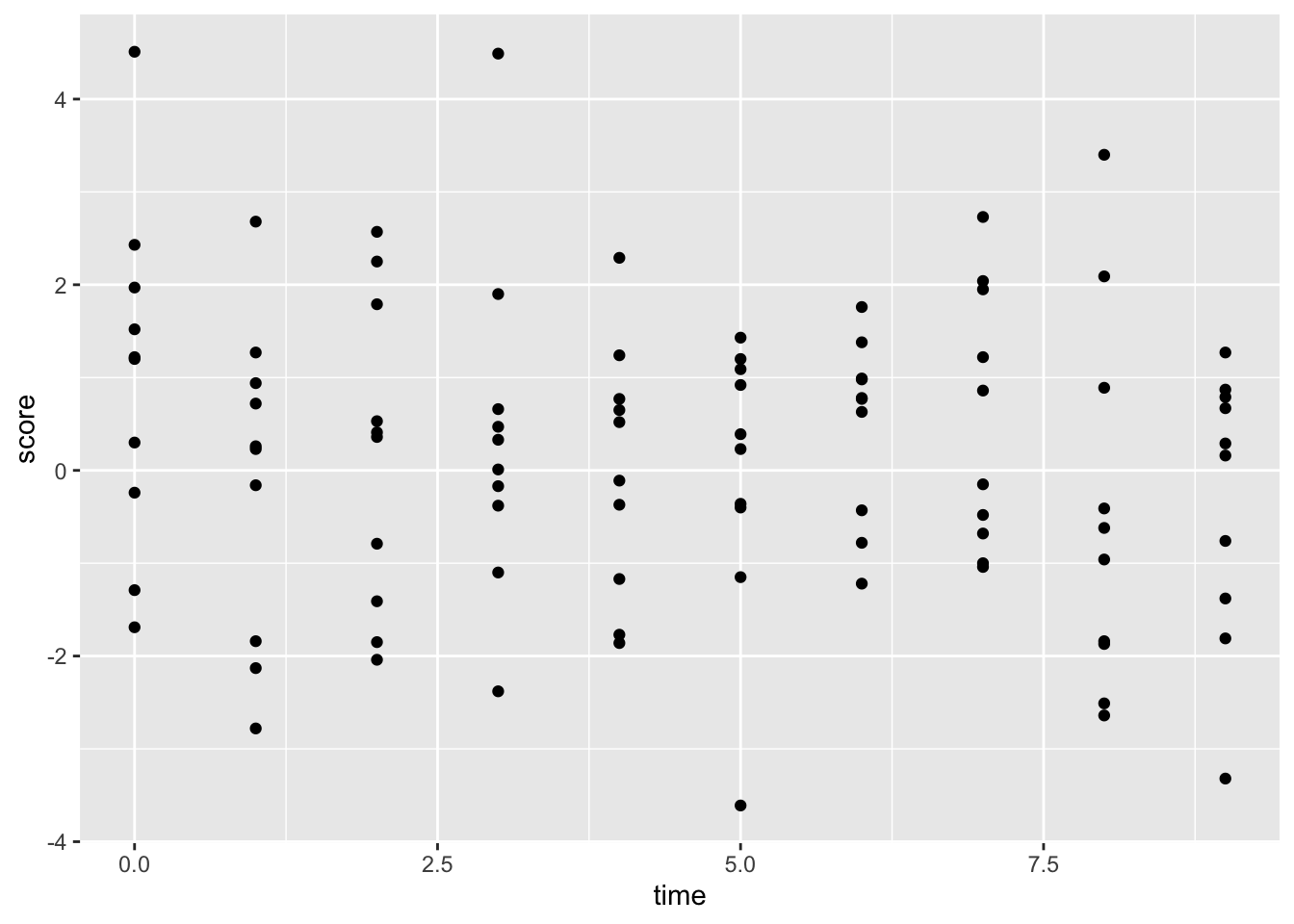
#This is a scatter plot showing the time series of the "score" variable ##Here we can try and connect the dots using “geom_line”
dat %>% ggplot(aes(x=time, y=score))+geom_point()+geom_line()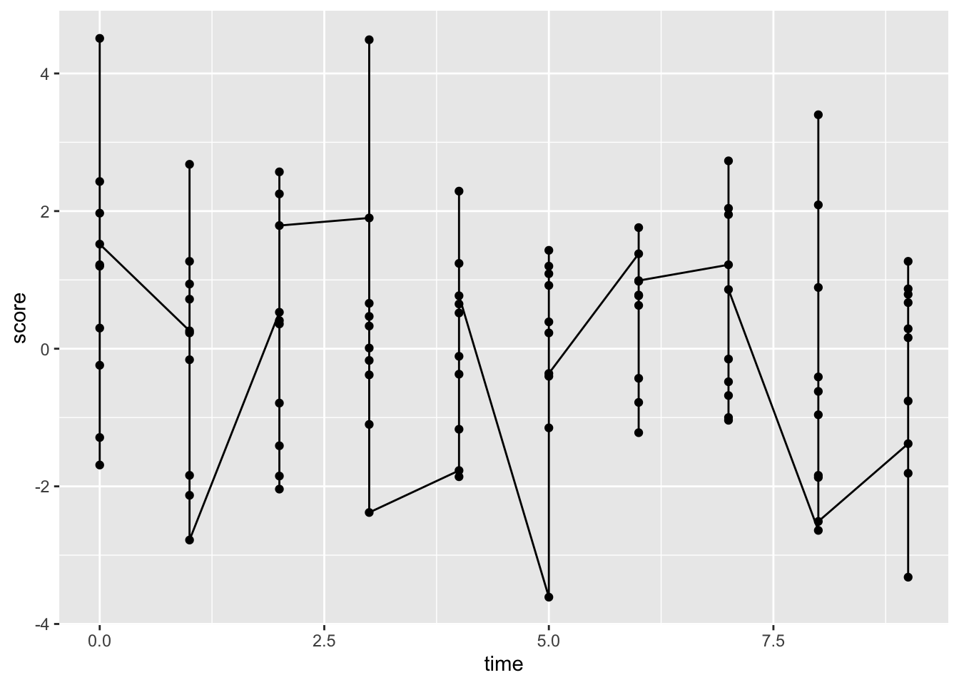
###Hmm….that seems wrong
##To get what we want we need to add a ‘group’ variable
dat %>%
  ggplot(aes(x=time, y=score, group=id))+ #set group to id
  geom_point()+
  geom_line()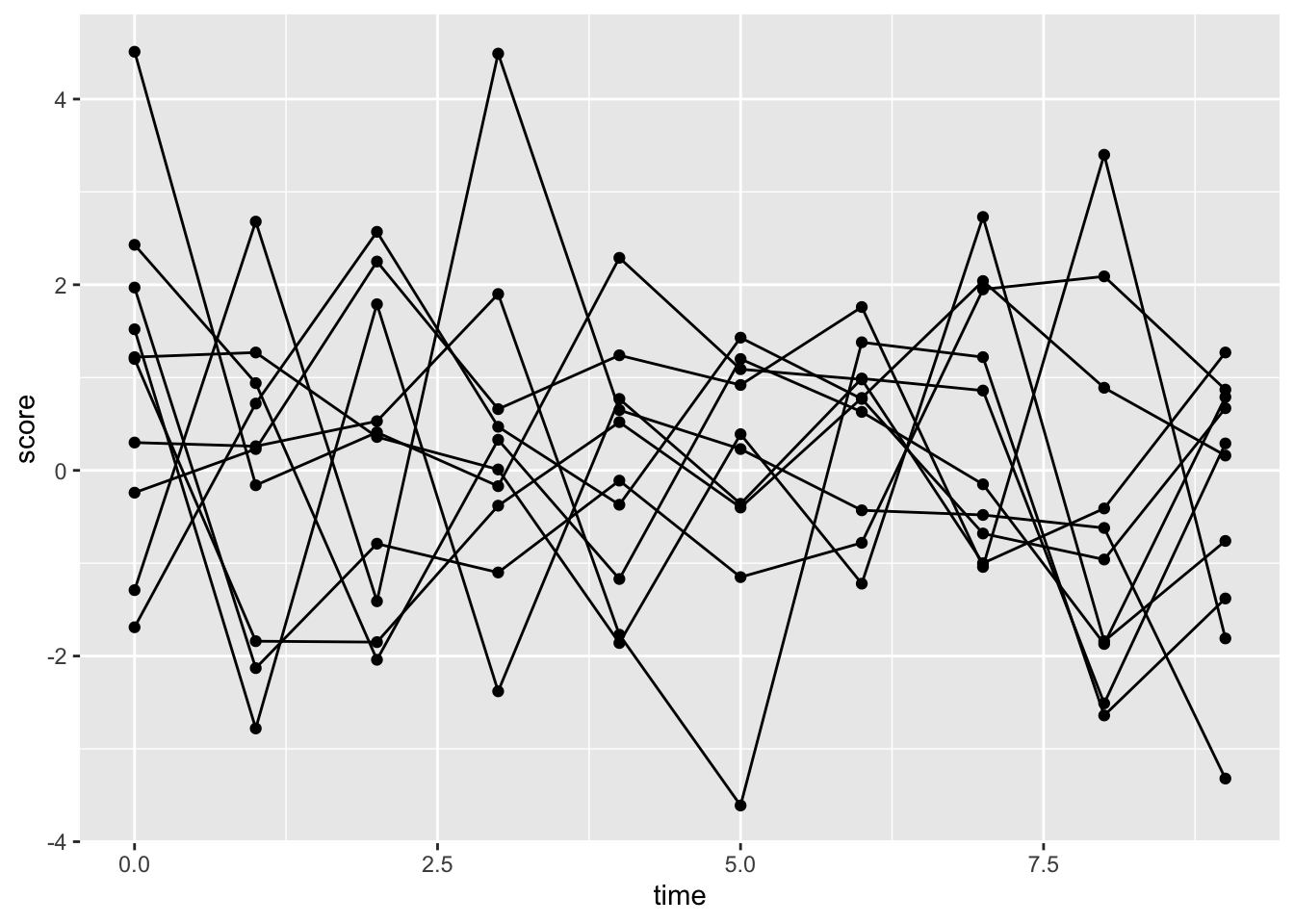
#Person-specific time-series of scores##We can set the lines to have a different color for each ID. This will automatically add a legend
dat %>%
  ggplot(aes(x=time, y=score, group=id, color=factor(id)))+geom_point()+geom_line()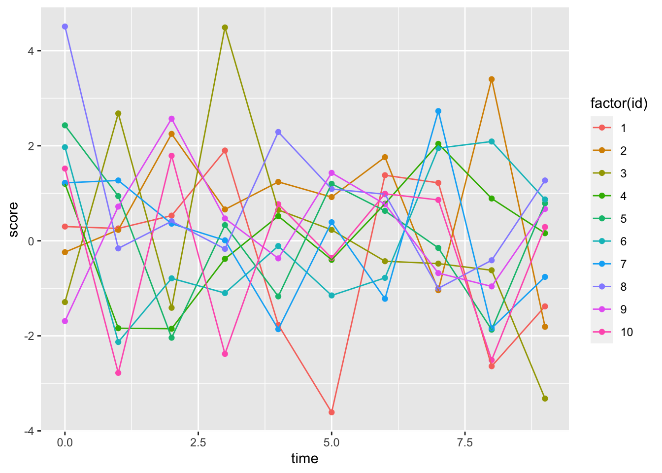
#Person-specific time-series##We can also modify the ‘theme’ of the plot; themes change how a plot looks
dat %>%
  ggplot(aes(x=time, y=score, group=id, color=factor(id)))+
  geom_point()+
  geom_line()+
theme_bw() #This is may favorite theme, there are also lots of others 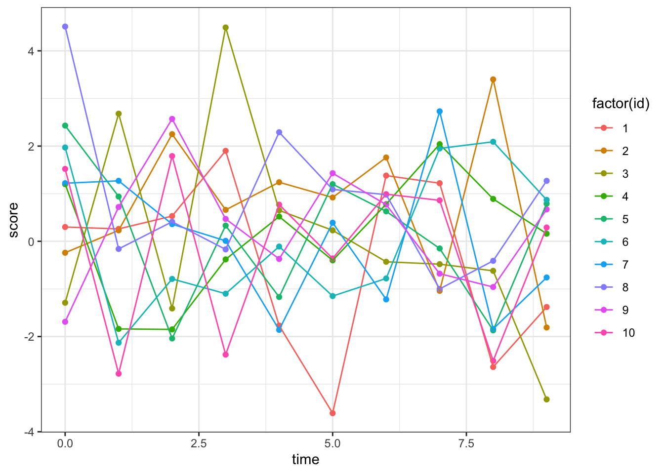
#Person-specific time-series with black+white theme##Let’s get rid of the legend on the right side of the plot
dat %>%
  ggplot(aes(x=time, y=score, group=id, color=factor(id)))+
  geom_point()+
  geom_line()+
  theme_bw()+
  theme(legend.position = "none") #This makes legends go away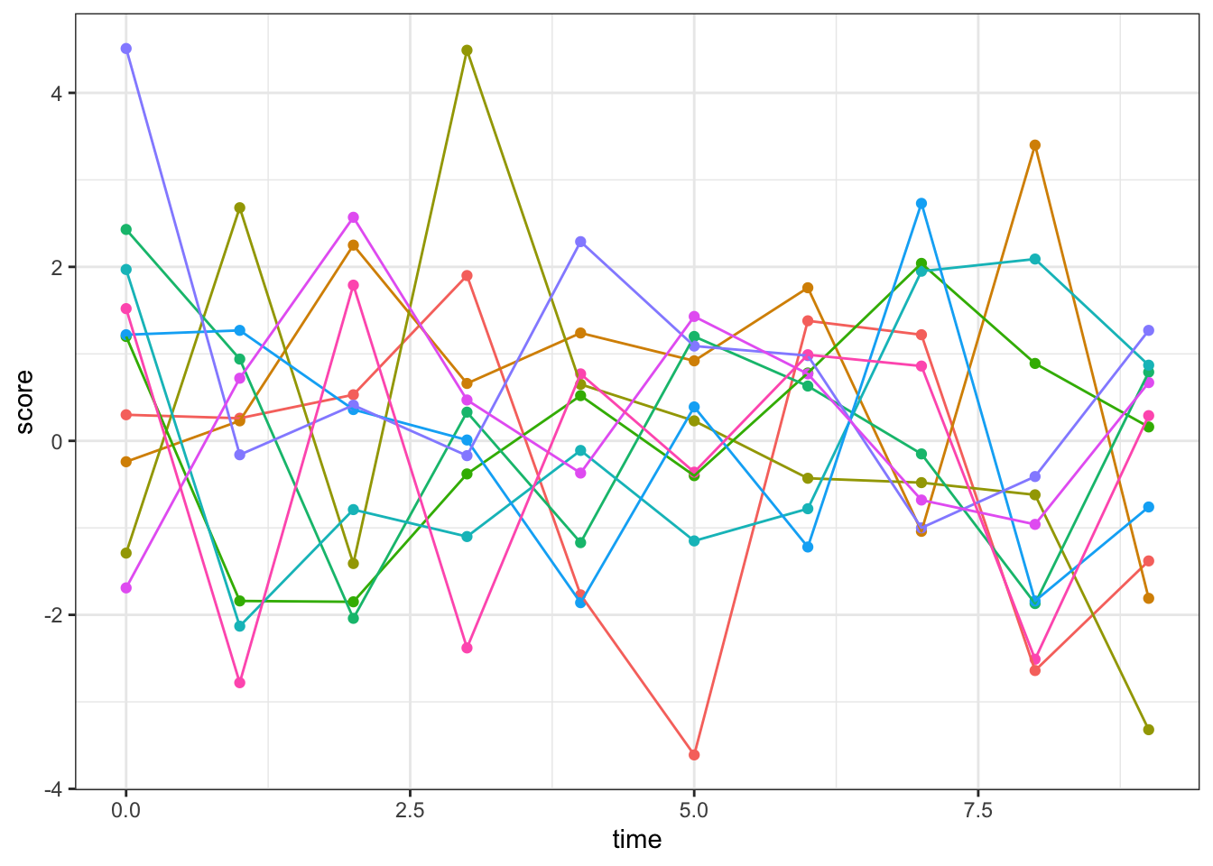
#Person-specific time-series with black+white theme and no legend##Now let’s produce the same plot for score 2
dat %>%
  ggplot(aes(x=time, y=score_2, group=id, color=factor(id)))+ #note the change in the 'y=' input
  geom_point()+
  geom_line()+
  theme_bw()+
  theme(legend.position = "none")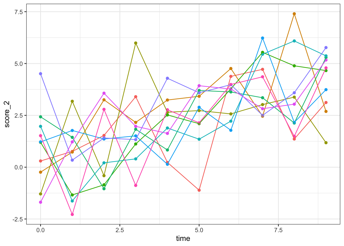
#Person-specific time-series with black+white theme and no legendAll of these seem to increase in a linear fashion (which we set them to do in the previous tutorial)
##Now we can add a regression line
dat %>%
  ggplot(aes(x=time, y=score_2))+ #note the change in the 'y=' input
  geom_point()+
  geom_smooth(method = "lm")+ #This adds a linear regression line
  geom_line(aes(group=factor(id), color=factor(id)), alpha=0.75)+
  theme_bw()+
  theme(legend.position = "none")
## `geom_smooth()` using formula 'y ~ x'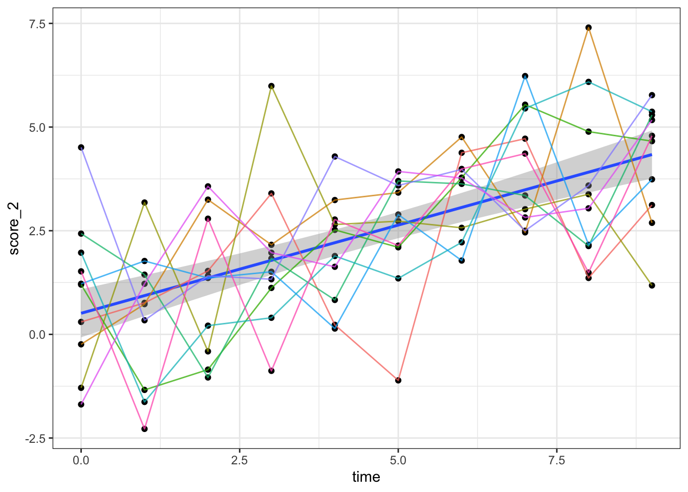
#Person-specific time-series with black+white theme and no legend##We can add a linear model (it’s in base R- tidy options are available but I use base for lm)
dat %>%
  ggplot(aes(x=time, y=score_2))+ #note the change in the 'y=' input
  geom_point()+
  geom_smooth(method = "lm")+ #This adds a linear regression line
  geom_line(aes(group=factor(id), color=factor(id)), alpha=0.75)+
  theme_bw()+
  theme(legend.position = "none")
## `geom_smooth()` using formula 'y ~ x'
dat %>% lm(score_2 ~ time, data=.) %>% summary()##
## Call:
## lm(formula = score_2 ~ time, data = .)
##
## Residuals:
## Min 1Q Median 3Q Max
## -3.7459 -0.9966 0.0721 0.9601 4.2048
##
## Coefficients:
## Estimate Std. Error t value Pr(>|t|)
## (Intercept) 0.50915 0.29216 1.743 0.0845 .
## time 0.42535 0.05473 7.772 7.75e-12 ***
## ---
## Signif. codes: 0 '***' 0.001 '**' 0.01 '*' 0.05 '.' 0.1 ' ' 1
##
## Residual standard error: 1.572 on 98 degrees of freedom
## Multiple R-squared: 0.3813, Adjusted R-squared: 0.375
## F-statistic: 60.41 on 1 and 98 DF, p-value: 7.745e-12This regression model shows that there is a significant increase in score 2 over time, on average
##We could also plot the distributions of score across all time point for each ID
dat %>%
  ggplot(aes(x=score_2))+ #note the change in the 'y=' input
  geom_density(aes(group=factor(id), fill=factor(id)), alpha=0.8)+
  theme_bw()+
  theme(legend.position = "none")+
  facet_wrap(~id, ncol = 5)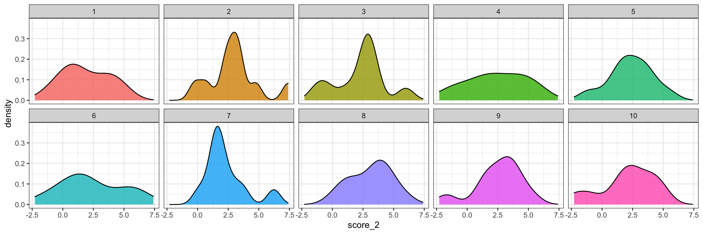
##We could also plot the bivariate relationship between ‘score’ and ‘score_2’
dat %>%
  ggplot(aes(x=score, y=score_2))+
  geom_point(aes(group=factor(id), color=factor(id)))+
  theme_bw()+
  theme(legend.position = "none")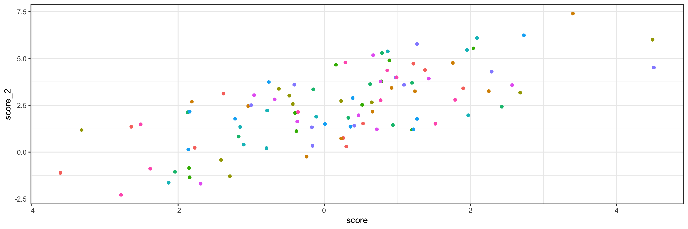
##Now we can write our first function. Functions are great if you plan to make the same kind of plot a bunch of times
bivariate_plot_function<-function(x){x %>% ggplot(aes(x=score, y=score_2))+
                                           geom_point(aes(group=factor(id), color=factor(id)))+
                                           theme_bw()+
                                           theme(legend.position = "none")}
##Let’s apply this function to to our data set
bivariate_plot_function(dat)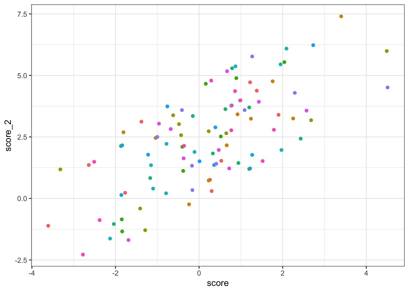
##Alright, no data to write out for tutorial 3. But, what if we wanted to save one of these plots?
##To save a plot, first assign it to an object and then use ‘ggsave’
plot_1<-dat %>%
  ggplot(aes(x=time, y=score_2))+ #note the change in the 'y=' input
  geom_point()+
  geom_smooth(method = "lm")+ #This adds a linear regression line
  geom_line(aes(group=factor(id), color=factor(id)), alpha=0.75)+
  theme_bw()+
  theme(legend.position = "none")

#Here is our person-specific time-series plot with a regression line
##Let’s view the plot object we just assigned
plot_1## `geom_smooth()` using formula 'y ~ x'
##Alright, now we can save it using ggsave. This will be saved as a pdf but you can alos use .png or other formats
ggsave(plot_1, file="plot_1.pdf", width = 12, height = 8)## `geom_smooth()` using formula 'y ~ x'###Plots are useful for looking at trends in your data. Modeling these trends statistically will be covered in tutorial #4